Revision history [back]
CSS should not use fixed width for elements with localizable text
I see lots of cosmetic bugs. By checking I found that most of the elements are of fixed width. It is a bad practice actually. Let say about button Ask you question if I use my locale translation it cut-off. It is because of css fixed width. same for fixed height also.
Need to maintain it by css padding and margin.
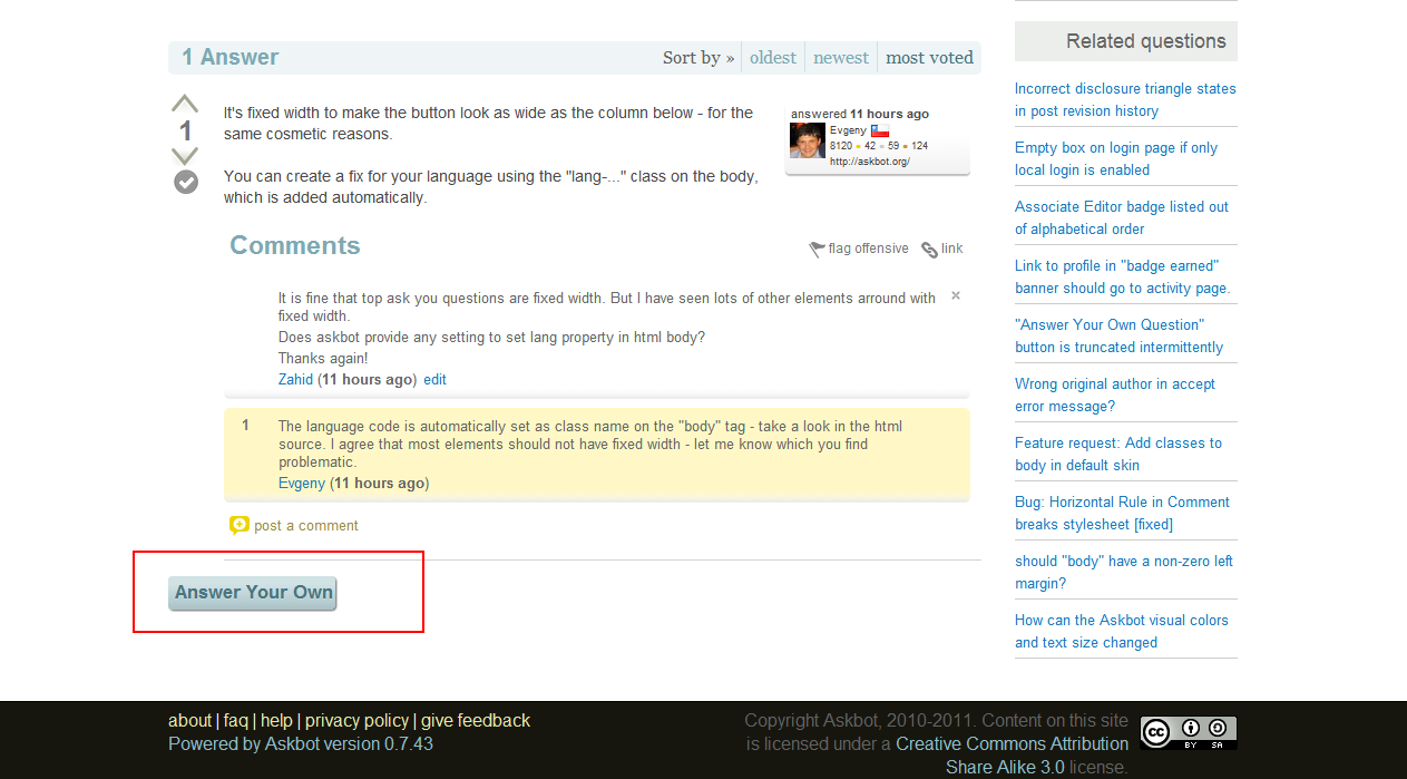
As per Evegeny's comment, I'm attaching a screenshot. But actually lots of problem in other pages also. This make such a great app ugly :(

See highlighted area with red rectangle.
CSS should not use fixed width for elements with localizable text
I see lots of cosmetic bugs. By checking I found that most of the elements are of fixed width. It is a bad practice actually. Let say about button Ask you question if I use my locale translation it cut-off. It is because of css fixed width. same for fixed height also.
Need to maintain it by css padding and margin.
As per Evegeny's comment, I'm attaching a screenshot. But actually lots of problem in other pages also. This make such a great app ugly :(

See highlighted area with red rectangle.
CSS should not use fixed width for elements with localizable textcss problem
I see lots of cosmetic bugs. By checking I found that most of the elements are of fixed width. It is a bad practice actually. Let say about button Ask you question if I use my locale translation it cut-off. It is because of css fixed width. same for fixed height also.
Need to maintain it by css padding and margin.
