First time here? Check out the FAQ!
0

Incorrect disclosure triangle states in post revision history

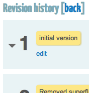
Looking at the revision history for a post, it seems like the disclosure triangle states are backwards:

Expanded
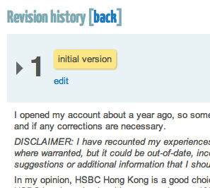
Expanded revision history, but disclosure triangle control shows collapsed state.

Collapsed

Collapsed revision history, but disclosure triangle shows expanded state.

Usually, the disclosure triangle is pointed sideways when the content is collapsed, and pointed down when the content is expanded.

Example from Mac OS X Human Interface Guidelines (emphasis mine):

Appearance and Behavior

A disclosure triangle is in the closed position (that is, pointing to the right) by default. When the user clicks a disclosure triangle, it points down and the additional information is displayed.

todofixthis's avatar
1.3k
todofixthis
asked 2012-03-22 09:24:31 -0600, updated 2012-04-14 15:40:20 -0600
edit flag offensive 0 remove flag close merge delete

Comments

add a comment see more comments

1 Answer

1

Not sure. Seems to be correct on this site, the image does not toggle correctly though, which I've fixed in the repo today.

On my development code base I see "bottom pointing" triangle when state is "open" and "right pointing" when the state is "closed". We'll get the "fake account" posting in and make a new release.

Evgeny's avatar
13.2k
Evgeny
answered 2012-07-17 01:09:47 -0600
edit flag offensive 0 remove flag delete link

Comments

Might have been fixed in a previous release then. Just verified here that it's working as expected (:

todofixthis's avatar todofixthis (2012-07-17 08:53:23 -0600) edit
add a comment see more comments